Villains of Valley View, Season 2
I was lucky enough to be Graphic Artist on this super fun Disney show!
Click images to see full size and details. Unless otherwise noted, all copy created by me/ Disney.
Production Designer: Lissette Schettini/ Art Director: Casey Margaret Craig
Prop Master: Addison Esson/ Set Decorator: Emily Dawson
Episode 19 – Bad Influence
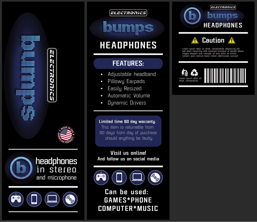
The last episode was a lot of fun. Did a whole game set up, starting with the logo for the video game console, to the game controller, and even the controller schematics! The logo I created in Photoshop, then layout in Illustrator. For the actual video game, I used images from iStock. Also, included, was a simple logo for the Valley View Times news van and microphone box, and a welcome banner for Starling.
Episode 18 – The Return
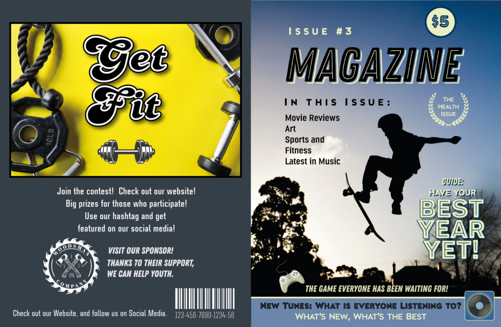
An easy week! Just one simple magazine cover. I actually loved coming up with magazine covers and the copy. They would just give me a couple of key words, like “teen” and “summer” and then I’d come up with the rest. It’s fun trying to be specific, while also vague. Lol.
Episode 17
This episode, a kazoo band needed a t-shirt. I was told, “Retro Nerd.” Couldn’t kazoo art on iStock, so created logo completely from scratch in Photoshop and Illustrator. For the dog biscuit box, had fun doing the research and coming up with the copy, besides designing it. This is a “trimmed” part of the box template.
Episode 15 – A Tale of Two Havocs
For the Save the Bees series, I rearranged a whole lot of individual dingbats to create the ornamentation. I was excited to do the catalogue, and put my own Save the Bees research in, since I wrote all the copy! I am hoping some background actor got bored and read the info and learned something! Click images to see full size and detail.
Below, a basketball run through Photoshop for flames, and a Havoc faux metallic sticker, created in Illustrator.
Episode 14 – The Haunted Jukebox
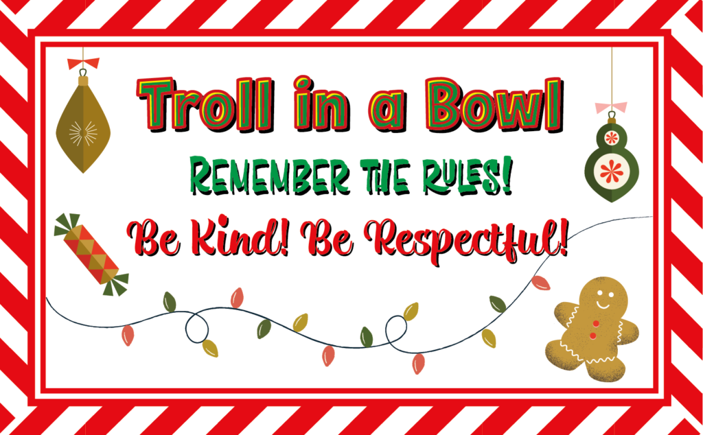
My favorite episode to work on! So incredibly fun to create a Halloween-themed Monopoly board. I came up with all the renaming, except my mother gets credit for coming up with Troll Toll. The drippy slime green lettering on the board was originally red for blood, but that had to be changed at the last minute, and I had a Bloodsucker Avenue that had to be changed, since Disney does not want references to blood. I was always aware that this was Disney and tried to find a balance – when researching Halloween inspiration, it is either little kid-cutesie, or slasher movie! Tried to find the happy medium.
Below, a label for a record, and a Cruddy Lip concert ticket.
Episode 13 – The Promposal
Footwear Magazine, laid out in Adobe Illustrator. Mayonnaise, created “wallpaper,” icons from iStock, but altered/ adapted for unified label.
Photo Booth banners for prom, which had an ocean/ space theme.
Episode 12 – Hidden Hero
It was a busy week in Valley View! Had to squeeze some things in small to make it all fit.
For the Hawaiian vacation ticket and the “Spicy Salsa,” elements found on iStock were incomplete – either size-wise, or more elements needed. I added the missing elements by hand, no AI needed! Still got it all done, and looking good!
Click to see images larger and see details.
Episode 11 – Power Struggle
Assignment: need newspaper clipping of character who turns into flame. Full stop. This took a few experiments with various flames and backgrounds. Image created in Photoshop, layout in Illustrator.
Hair gel label, created in Adobe Illustrator.
Episode 10 - Family Secrets
What a great episode! Photos of actors were given to me, then I found several iStock photos to do a composite for historical text book photo, then aged. When giving me the photos, I wasn’t given too much direction, other than “really old.” Which gave me room to see what worked, and just play!
When creating the book, I used Photoshop to create the aged paper look.
I also had to do a photo composite of two actors, with pics taken from their younger days. One was a blurry color photo, one was a high res black and white. Yes, I used the Photoshop AI colorization feature, but everything else was done old school Photoshop – cutting and pasting, and hand drawing over elements to make them blend in.
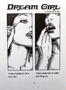
Then a footwear magazine! I LOVE doing magazines! And I would just be told a general theme (here: footwear), then I come up with everything myself. So fun.
An easy week. A super fun Gamer’s magazine, and a label, that I ran through Photoshop to “age” just the right way.
Episode 8 - Fired Up
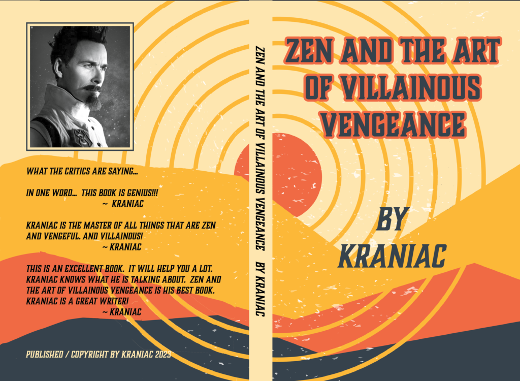
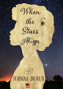
For the book cover, only found partial art on iStock that I liked for the cover. I filled in by hand the whole space, (drawing in Photoshop), mimicking the style, for a full back and front cover. This was fun because I was given no leads on what anyone was expecting, so just randomly came up with something. (Had a couple of other samples, too, of course.). Also, had fun coming up with the copy for the “Critic’s quotes,” which I just put as filler, being goofy, but ultimately was kept!
Below, ice cream container and comment card, created in Adobe Illustrator.
The usual created in Adobe Illustrator, with some images from iStock. For “Artist’s Friend”, I also created the wallpaper for the packaging.
Episode 6 - Party People
This is just a selection, of a whole series of menus and pamphlets I created for Madame Millicent’s Tea Room. Images from iStock, laid out in Illustrator. What was fun about this was coming up with all the copy. I studied a lot of tea house menus online, but came up with my own menu and sales pitches!
Click to see details.
Episode 5 - Overnight Success
Episode 4 - Dojo Mojo
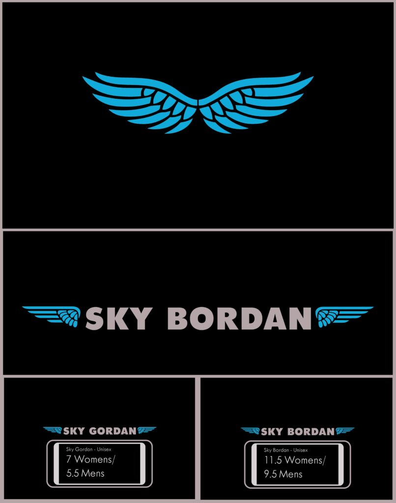
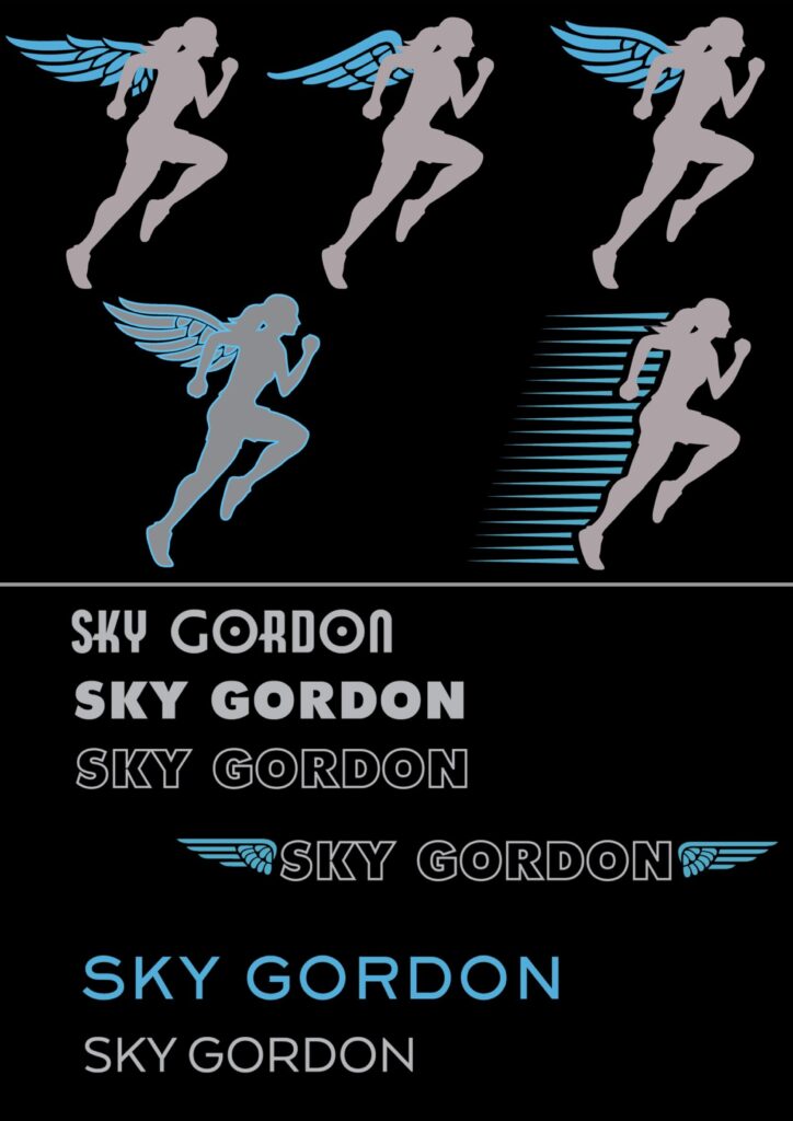
This episode I did a logo and the template for a shoebox. There was a gag used where there is also a “rip off” company with a similar name, which is why there is both Sky Gordon and Sky Bordon.
On the right were samples I gave. Ultimately, they decided they wanted a gender neutral logo.
Episode 3 - Power Hungry
Mural size Lego wall created in Photoshop. Created Lego pattern “wallpaper” then clipped out edges to create stacked Lego’s. All colors matched to actual Lego colors.
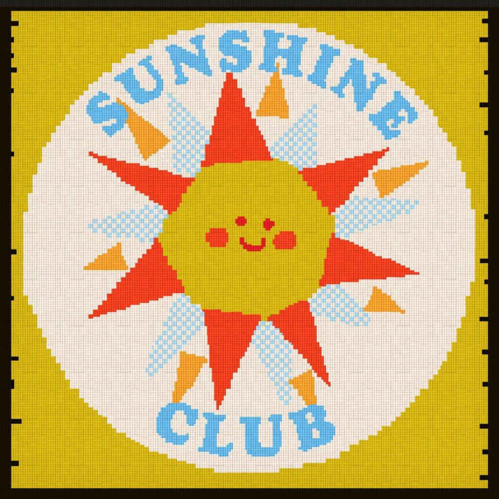
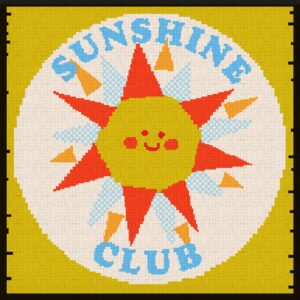
Below Lego wall, are Sunshine Club flyers, banners, and posters. These images are more illustration than graphic art, since I drew them out by hand in Illustrator, since the iStock images I was given as a reference didn’t adapt the way I wanted to.
The hand drawn look also went better with the concept of a school fair.

